Navigation
Navigation as Structural Design
Navigation is the most structurally consequential UI element on any page. It determines how people discover content, how search engines understand hierarchy, and how the entire page layout responds to interaction. Getting navigation wrong cascades into every other design decision.
The pieces in this collection explore navigation not as a solved problem but as a design space with real trade-offs. Hamburger menus save space but hide structure. Mega-menus expose depth but overwhelm on touch devices. Tab systems work beautifully for flat hierarchies but collapse under deep nesting.
Patterns in This Collection
Responsive Header Navigation covers the full range from simple horizontal link bars to complex multi-level dropdown systems that adapt cleanly across breakpoints.
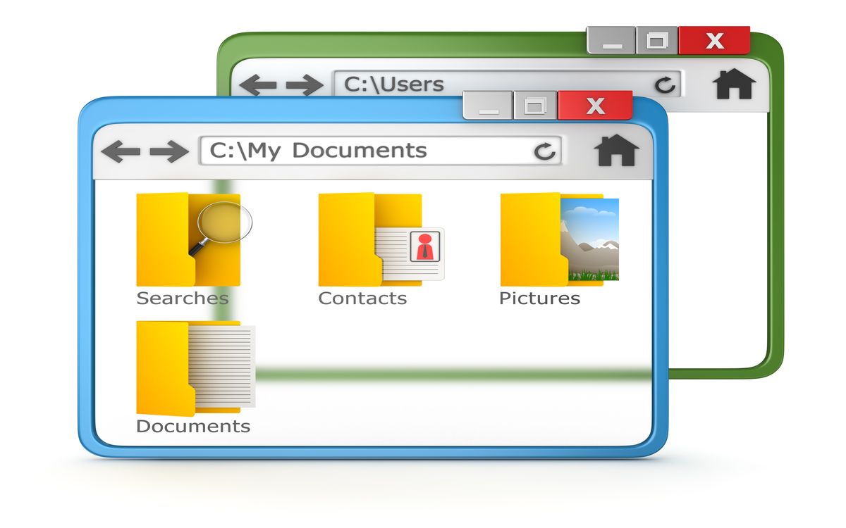
Sidebar Navigation explores persistent vertical menus, collapsible trees, and hybrid approaches that combine sidebar structure with overlay behavior on smaller screens.
Tab and Segment Controls cover horizontal selection patterns used for in-page content switching. The best implementations handle keyboard arrow navigation, ARIA roles, and smooth content transitions.
Mobile Drawer and Slide Patterns go beyond the basic hamburger toggle to explore full-screen overlays, partial drawers, and gesture-driven interactions.
Breadcrumb and Wayfinding covers structural navigation indicators that help users understand where they are within a content hierarchy.
Accessibility Is Not Optional
Navigation is where accessibility failures cause the most damage. Every piece in this collection should be evaluated against these fundamentals: keyboard operability, visible focus states, correct ARIA roles and properties, screen reader announcement patterns, and escape-key dismissal for overlays.
Related Reading
- CSS Architecture for Small Visual Projects covers structuring CSS for component-based UI patterns
- Accessibility for Decorative Motion addresses reduced-motion and focus management
- Micro-Interactions explores the small animated details that make navigation feel polished