From CodePen to Production Thinking
CodePen is the sketchbook of front-end development. It is where ideas happen fast, where constraints are loose, and where visual experiments can go from concept to working demo in an hour. But there is a persistent gap between a polished Pen and production-ready code. The techniques that make CodePen experiments shine (viewport-unit sizing, fixed dimensions, bare elements, omitted accessibility attributes) create real problems when the same code needs to live inside an actual product. This guide bridges that gap, covering the practical steps to take experimental browser work and harden it for real-world deployment. We cover isolation patterns, responsive adaptation, dependency audits, accessibility retrofits, performance profiling, and the mindset shift that separates prototyping from production work.
The Sketchbook Mindset vs. the Shipping Mindset
A CodePen is a proof of concept. It answers the question “can this be done?” Production code answers a different question: “can this be done reliably, accessibly, and maintainably across devices, browsers, and usage patterns?”
The gap between those questions is not about code quality. Many CodePen experiments are beautifully written. The gap is about context. A Pen runs in a controlled environment with a single viewport, no surrounding layout, no conflicting styles, and a known browser. Production code runs in the wild.
Recognizing this difference is the first step. Do not feel bad about CodePen code that does not translate directly. That is by design. The goal is to extract the creative core of the experiment and reconstruct its supporting structure for a different environment.
Step One: Isolate the Core
Before porting anything, identify what makes the experiment interesting. Strip away the demo-specific scaffolding (centered layout containers, viewport-sized wrappers, decorative backgrounds) and find the essential technique. That technique is what you are porting. Everything else gets rebuilt.
Write down in one sentence what the experiment does. “A circular progress indicator using conic-gradient and CSS custom properties.” “A card hover effect that lifts and rotates using 3D transforms.” That sentence defines the scope of what needs to survive the transition.
Step Two: Audit Dependencies
CodePen makes it easy to include external resources. Check for:
- External CSS frameworks loaded via CDN (are they necessary for the effect?)
- JavaScript libraries included for a single function (can that function be written natively?)
- Google Fonts or icon libraries loaded in settings (do they need to come along?)
- Preprocessor features (Sass nesting, SCSS variables) that need compilation support
Every dependency you can remove is one fewer thing to load, version, and maintain. If the core technique works with vanilla CSS and JavaScript, ship it that way.
Step Three: Responsive Redesign
Most CodePen experiments are built for a single viewport size, often 400 to 600 pixels wide in the editor preview. Production code needs to work from 320px mobile to 2560px ultrawide, and at every size in between.
Start by replacing fixed pixel values with relative units. Convert width: 400px to a max-width with percentage-based sizing. Convert fixed font sizes to clamp-based fluid typography. Convert absolute positioning to CSS Grid or Flexbox placement where possible.
Test at three key sizes: 360px (small phone), 768px (tablet), and 1280px (desktop). If it works at these three breakpoints, it will usually work everywhere with minor adjustments.
Step Four: Accessibility Retrofit
This is where most CodePen-to-production transitions fall short. Common issues:
- Decorative elements missing
aria-hidden="true" - Interactive elements built from
divinstead ofbutton - No visible focus states
- Animations with no reduced-motion alternative
- Color combinations that fail contrast ratios
- Missing text alternatives for visual content
Work through these systematically. Tab through the component with keyboard only. Run it through a contrast checker. Test with a screen reader. These checks add 30 minutes to the porting process and prevent real usability failures.
Step Five: CSS Encapsulation
In CodePen, your CSS is the only CSS on the page. In production, your component shares the page with navigation, footers, sidebars, ads, and every other component. Style isolation matters.
Options for encapsulation:
- BEM naming convention prevents class collisions through namespaced selectors
- CSS Modules (if using a build tool) automatically scope class names
- Shadow DOM provides true style isolation but has trade-offs for forms and accessibility
- Scoped custom properties use a namespace prefix on CSS variables to prevent global conflicts
The simplest approach for small components is BEM-style naming: .progress-ring, .progress-ring__track, .progress-ring__fill. This costs nothing, requires no build tooling, and prevents most collision issues.
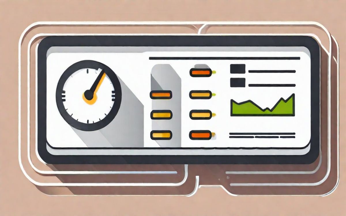
Step Six: Performance Check
Run a Lighthouse audit against a test page containing the ported component. Look specifically at:
- Total Blocking Time (does the component’s JavaScript block the main thread?)
- Cumulative Layout Shift (does the component cause layout shift during load?)
- Paint complexity (is the component triggering excessive repaint?)
If the component uses animation, profile it with DevTools Performance panel under CPU throttle. Smooth animation on your development machine is not a meaningful test.
Step Seven: Document and Integrate
Write a brief usage note for the component: what it does, what markup structure it expects, what CSS custom properties it exposes for theming, and what accessibility attributes are required. This documentation is for future-you as much as anyone else.
Integrate the component into your project’s CSS architecture. It should follow the same naming convention, use the same custom property namespace, and respect the same responsive breakpoints as the rest of the codebase.
The Ongoing Practice
The best front-end developers maintain a continuous loop between experimentation and production. CodePen is the lab. Production is the field. Each context teaches different lessons. The techniques in this guide make the transfer between them smoother, but the real skill is developing judgment about which experiments deserve the production treatment and which are better left as sketches.
Related Reading
- CSS Architecture for Small Visual Projects covers organizing CSS for component-based work
- How to Document UI Experiments discusses capturing process and decisions
- The Case for Small Reusable Pattern Libraries argues for curating your best experiments