Recreating Visual Shots in HTML and CSS
Turning a visual reference into working browser code is one of the most useful skills a front-end developer can sharpen. It forces you to understand CSS properties deeply rather than reaching for the first Stack Overflow snippet that approximates the look. In this guide, I walk through the full process of taking a design screenshot or visual concept and recreating it faithfully with HTML and CSS, drawing on patterns developed through years of gallery curation and hands-on implementation work. We cover structural analysis, layering strategy, typography matching, color extraction, responsive adaptation, and the common pitfalls that trip up even experienced developers.
For readers who want to understand how individual CSS properties interact at a rendering level, the MDN Web Docs remain the most reliable reference for specification details and browser compatibility tables.
Start With Structure, Not Style
The most common mistake when recreating a visual reference is jumping straight to colors and fonts. Before writing any CSS, study the structural composition. What are the distinct visual blocks? How do they relate spatially? Where are the containment boundaries?
Sketch the layout hierarchy on paper or in a notes app. Identify the outermost container, the major sections, and the nested components. This gives you a clean HTML outline before any styling begins.
A typical recreation might break down into three to five structural layers: a page wrapper, a content region, a card or panel group, and individual elements within each card. Getting this hierarchy right in HTML means your CSS can use inheritance and cascade rather than fighting against a flat structure.
Measure and Proportion
Exact pixel recreation is sometimes necessary, but proportional accuracy matters more for most gallery work. Use relative units where possible. If a sidebar takes up roughly one-third of the viewport and the main content takes two-thirds, express that relationship rather than hardcoding pixel widths.
For spacing, look for a baseline rhythm in the reference. Many well-designed interfaces use a 4px or 8px grid. If you can identify the grid, your spacing decisions become systematic rather than arbitrary. Examine padding, margin, and gap values for consistent multiples.
Typography sizing follows a similar logic. Rather than trying to match exact pixel sizes from a screenshot, identify the type scale ratios. Is the heading roughly twice the body size? Is the caption about 80% of the body? Establish the scale and work from there.
Color Extraction and Application
Use a color picker tool to extract the key colors from your reference. Most interfaces use three to five colors: a dominant surface color, a text color, one or two accent colors, and a border or divider tone.
When recreating, resist the temptation to match colors exactly from a compressed screenshot. JPEG compression shifts colors, and screenshots taken on different monitors will vary. Instead, identify the hue family and relative lightness, then build your palette from clean values.
For dark interfaces, pay close attention to how surface colors layer. A dark theme is rarely one shade of gray. There is usually a canvas color, a raised-surface color, and an inset color, each separated by a few lightness steps. Getting this layering right is what makes a dark recreation feel solid rather than flat.
Typography Matching
You will not always know which fonts a reference uses. That is fine. What matters is matching the visual characteristics: serif or sans-serif, geometric or humanist, the x-height, the weight range, and the letter-spacing.
If the reference uses a font you can identify, use it. If not, pick a close match from a system font stack or a well-known web font. The goal is visual fidelity to the reference’s typographic personality, not forensic font identification.
Pay attention to line-height. Most body text reads well between 1.5 and 1.7. Headings usually tighten to 1.1 to 1.25. Getting line-height wrong makes even correctly-matched fonts look off.
Layering and Depth
Visual depth in CSS comes from a small set of tools: box-shadow, background layering, border, outline, and z-index stacking. Study your reference for shadow direction, blur radius, and spread. A shadow that falls down and to the right with moderate blur suggests a light source above-left. Match that consistently across all elements.
For layered backgrounds, use CSS gradients, multiple background declarations, or pseudo-elements. A single div with ::before and ::after gives you three stacking surfaces before you add any child elements. That is enough for most card-style compositions.
Borders and outlines deserve more attention than they usually get. A 1px border on a card in a dark interface is doing structural work. Removing it makes the card float vaguely. Making it too heavy makes the layout feel gridded and rigid. Match the reference’s border weight and opacity precisely.
Responsive Adaptation
Most visual references show a single viewport size. Your recreation needs to work across breakpoints. Start with the reference size, get it right, then adapt outward.
For narrower viewports, decide which structural relationships should compress (reducing padding, stacking columns) versus which should reflow (moving a sidebar below the main content). The proportional relationships you established early make this easier because they are already expressed in relative terms.
For wider viewports, decide whether the layout should continue to grow or hit a max-width constraint. Most editorial layouts benefit from a maximum content width between 720px and 900px for body text, with full-width sections available for visual elements.
Common Pitfalls
Over-nesting HTML. If your recreation requires five or six levels of nested div elements, step back and reconsider the structure. Most visual compositions can be expressed with two to three levels of meaningful containment.
Pixel-matching at the wrong scale. Getting a 1px detail right while the overall spacing is off creates a strange uncanny valley. Get proportions and spacing right first, then refine details.
Ignoring the cascade. If you find yourself overriding styles constantly, your specificity model is fighting you. Use class-based selectors, keep specificity flat, and let inheritance carry shared properties.
Neglecting font rendering. System font rendering varies dramatically between macOS, Windows, and Linux. Test your recreation on at least two operating systems. -webkit-font-smoothing: antialiased can help on macOS but does nothing elsewhere.
From Recreation to Understanding
The real value of visual recreation work is not the finished piece. It is the intuitive understanding of CSS that builds through the process. After recreating twenty or thirty different designs, you start to see new visual references and immediately understand the CSS approach they require. That fluency transfers directly into every other front-end task.
Related Reading
- CSS Architecture for Small Visual Projects covers organizing your CSS for recreation work
- SVG Workflows for Interface Illustration for when your recreation includes vector illustrations
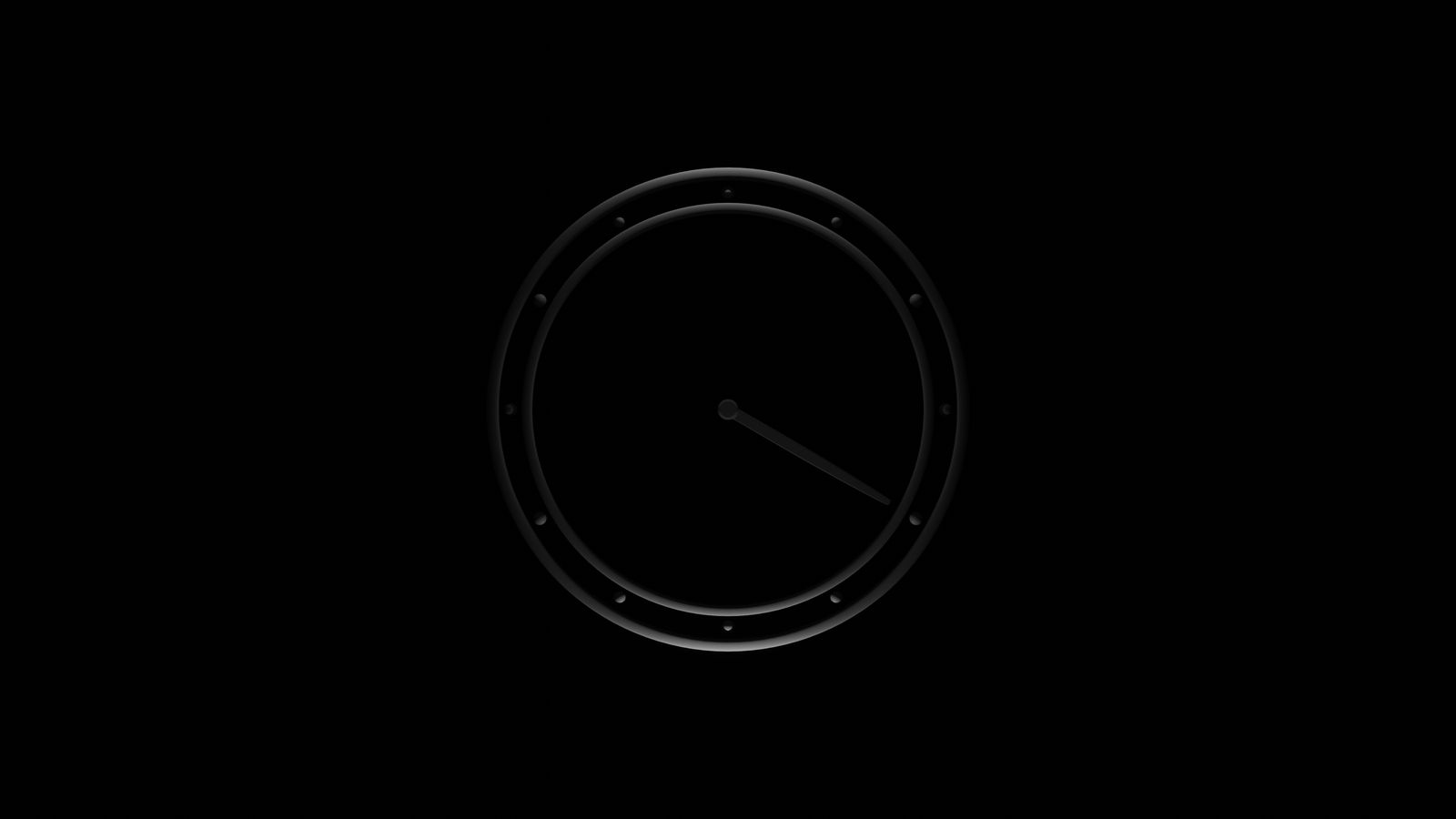
- Clocks and Illustrations demonstrate recreation techniques in practice