Animated Clock: Pure CSS
The Appeal of CSS Clocks
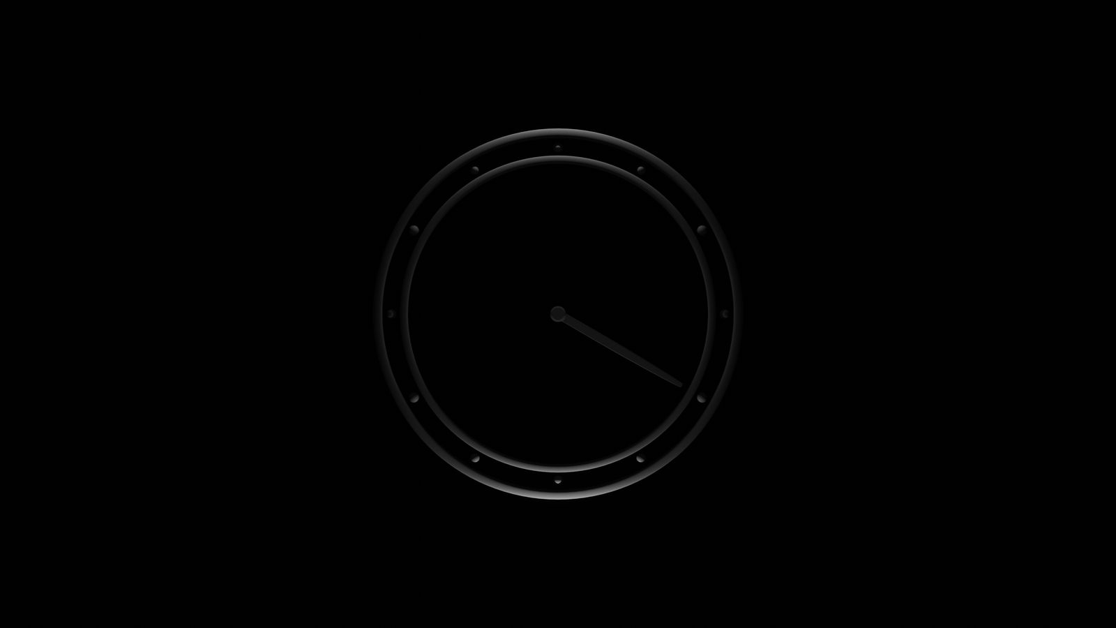
Building a working clock face with nothing but CSS is one of those challenges that teaches you more about the rendering engine than any tutorial. There is no JavaScript driving the hands. No setInterval ticking away in the background. Just CSS transforms, animation keyframes, and a precise understanding of how transform-origin determines the pivot point of a rotating element.
Jan Jatam’s pure CSS clock takes this constraint and produces something genuinely elegant. The clock face is clean, the hands move with believable physics, and the whole thing runs on the browser’s animation engine with no scripting overhead.
What makes this piece worth studying is not just that it works. Plenty of CSS clocks work. It is that the approach demonstrates how much visual complexity you can achieve with a small number of CSS properties used precisely.
How the Rotation Works
The fundamental mechanism is transform: rotate() applied to elements representing the clock hands. Each hand is an absolutely positioned element, anchored at the center of the clock face using transform-origin.
For the hour hand, a full rotation (360 degrees) represents 12 hours. The CSS animation completes one cycle over 43200 seconds (12 hours). For the minute hand, one rotation represents 60 minutes, so the animation cycles over 3600 seconds. The second hand completes one rotation every 60 seconds.
The critical detail is transform-origin. If the origin defaults to the center of the hand element, the hand rotates around its midpoint instead of the clock center. Setting transform-origin: 50% 100% (or the appropriate value based on hand positioning) pins the rotation to the correct pivot.
.hand-hour {
  transform-origin: 50% 100%;
  animation: rotate 43200s linear infinite;
}

.hand-minute {
  transform-origin: 50% 100%;
  animation: rotate 3600s linear infinite;
}

.hand-second {
  transform-origin: 50% 100%;
  animation: rotate 60s linear infinite;
}

@keyframes rotate {
  from { transform: rotate(0deg); }
  to   { transform: rotate(360deg); }
}
The linear timing function is important here. Any easing would make the hand movement uneven, which looks wrong for a clock. Mechanical clocks move at a constant rate (or in discrete ticks), so linear rotation matches physical expectation.
Timing Function Nuances
The choice between linear and steps() reflects a design decision about what kind of clock you are modeling. A smooth sweep mimics a quartz movement where the second hand glides continuously. A stepped animation using animation-timing-function: steps(60) mimics a mechanical movement where the hand ticks discretely.
Jan Jatam’s implementation uses smooth rotation, which gives the clock a modern, minimal feel. Switching to stepped animation for the second hand while keeping smooth rotation for the hour and minute hands creates a hybrid that some viewers find more satisfying.
The Face and Marks
The clock face is typically a circular container using border-radius: 50%. Tick marks for hours and minutes can be achieved several ways:
- Repeated pseudo-elements with rotation transforms
- A circular gradient pattern using
conic-gradientorrepeating-conic-gradient - Individual elements positioned absolutely and rotated around the center
The pseudo-element approach is most common in pure CSS implementations because it avoids adding extra HTML elements. Each mark is a ::before or ::after on a container element, rotated by the appropriate increment (30 degrees for hour marks, 6 degrees for minute marks).
Performance Profile
Pure CSS clocks are remarkably efficient. The transform property is compositor-friendly, meaning the rotation happens on the GPU without triggering layout or paint. Once the browser has composited each hand as a separate layer, the ongoing animation cost is near zero.
This makes CSS clocks suitable as decorative elements on pages that need to remain responsive. A CSS clock running in the background does not compete for main-thread resources the way a JavaScript-driven animation would.
The one caveat: if you apply complex box-shadow or filter effects to the rotating hands, each frame may trigger paint. Keep the hand elements simple (solid colors, no shadows) for optimal performance.
Accessibility Notes
A pure CSS clock is inherently decorative because it does not communicate time to assistive technology. The animation produces no text output, and the rotational position of a CSS element is not exposed to the accessibility tree.
If the clock is purely decorative, wrap it in aria-hidden="true" so screen readers skip it entirely. If the clock is the primary time display on a page (unlikely, but possible), pair it with a visually hidden <time> element or aria-live region that updates with the current time via JavaScript, accepting that the time component of the interface requires some scripting even if the visual component does not.
For users with prefers-reduced-motion enabled, consider pausing the animation or replacing it with a static clock face showing a fixed time. A stopped clock is still visually informative; a removed clock leaves a gap.
What This Teaches
The value of studying a pure CSS clock is not that you will build many clocks in production. It is that the technique cluster, transform-origin, rotation animation, timing functions, pseudo-element positioning, and GPU-friendly property selection, applies directly to dozens of other UI patterns: circular menus, radial progress indicators, gauge displays, and any interface element that involves rotation.
Understanding how Jan Jatam constructed this piece gives you a set of reusable building blocks that extend well beyond clock faces.
Related Reading
- Clocks features additional clock implementations with varied techniques
- Animation Performance in Real UI covers the performance principles demonstrated here
- Recreating Visual Shots in HTML and CSS discusses the general approach to translating visual ideas into browser code
- Accessibility for Decorative Motion covers reduced-motion implementation for visual interfaces